Python provides one of a most popular plotting library called Matplotlib . It is open-source, cross-platform for making 2D plots for from data in array. It is generally used for data visualization and represent through the various graphs.
Matplotlib is originally conceived by the John D. Hunter in 2003. The recent version of matplotlib is 2.2.0 released in January 2018.
Before start working with the matplotlib library, we need to install in our Python environment.
Installation of Matplotlib
Type the following command in your terminal and press enter.
- pip install matplotlib
The above command will install matplotlib library and its dependency package on Window operating system.
Basic Concept of Matplotlib
A graph contains the following parts. Let’s understand these parts.
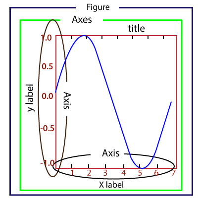
Figure: It is a whole figure which may hold one or more axes (plots). We can think of a Figure as a canvas that holds plots.
Axes: A Figure can contain several Axes. It consists of two or three (in the case of 3D) Axis objects. Each Axes is comprised of a title, an x-label, and a y-label.
Axis: Axises are the number of line like objects and responsible for generating the graph limits.
Artist: An artist is the all which we see on the graph like Text objects, Line2D objects, and collection objects. Most Artists are tied to Axes.
Introduction to pyplot
The matplotlib provides the pyplot package which is used to plot the graph of given data. The matplotlib.pyplot is a set of command style functions that make matplotlib work like MATLAB. The pyplot package contains many functions which used to create a figure, create a plotting area in a figure, decorates the plot with labels, plot some lines in a plotting area, etc.
We can plot a graph with pyplot quickly. Let’s have a look at the following example.
Basic Example of plotting Graph
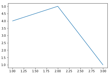
Here is the basic example of generating a simple graph; the program is following:
from matplotlib import pyplot as plt
#ploting our canvas
plt.plot([1,2,3],[4,5,1])
#display the graph
plt.show()
Output:
Ploting Different Type of Graphs
We can plot the various graph using the pyplot module. Let’s understand the following examples.
1. Line Graph
The line chart is used to display the information as a series of the line. It is easy to plot. Consider the following example.
Example -
from matplotlib import pyplot as plt

x = [1,2,3]
y = [10,11,12]

plt.plot(x,y)

plt.title("Line graph")
plt.ylabel('Y axis')
plt.xlabel('X axis')
plt.show()
Output:
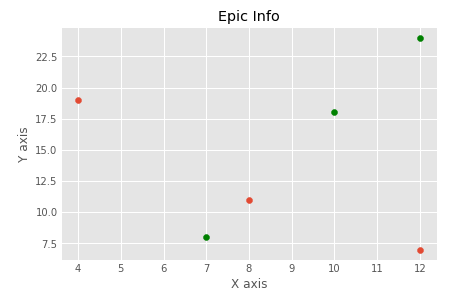
The line can be modified using the various functions. It makes the graph more attractive. Below is the example.
Example -
from matplotlib import pyplot as plt
from matplotlib import style

style.use('ggplot')
x = [10, 12, 13]
y = [8, 16, 6]
x2 = [8, 15, 11]
y2 = [6, 15, 7]
plt.plot(x, y, 'b', label='line one', linewidth=5)
plt.plot(x2, y2, 'r', label='line two', linewidth=5)
plt.title('Epic Info')
fig = plt.figure()
plt.ylabel('Y axis')
plt.xlabel('X axis')

plt.show()
2. Bar Graph
Bar graph is one of the most common graphs and it is used to represent the data associated with the categorical variables. The bar() function accepts three arguments - categorical variables, values, and color.
Example -
from matplotlib import pyplot as plt
Names = [‘Arun’,‘James’,‘Ricky’,‘Patrick’]
Marks = [51,87,45,67]
plt.bar(Names,Marks,color = ‘blue’)
plt.title(‘Result’)
plt.xlabel(‘Names’)
plt.ylabel(‘Marks’)
plt.show()
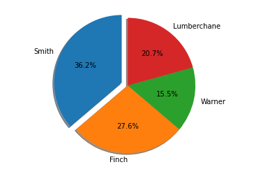
3. Pie Chart
A chart is a circular graph which is divided into the sub-part or segment. It is used to represent the percentage or proportional data where each slice of pie represents a particular category. Let’s understand the below example.
Example -
from matplotlib import pyplot as plt

# Pie chart, where the slices will be ordered and plotted counter-clockwise:
Aus_Players = 'Smith', 'Finch', 'Warner', 'Lumberchane'
Runs = [42, 32, 18, 24]
explode = (0.1, 0, 0, 0)  # it "explode" the 1st slice

fig1, ax1 = plt.subplots()
ax1.pie(Runs, explode=explode, labels=Aus_Players, autopct='%1.1f%%',
        shadow=True, startangle=90)
ax1.axis('equal')  # Equal aspect ratio ensures that pie is drawn as a circle.

plt.show()
Output:
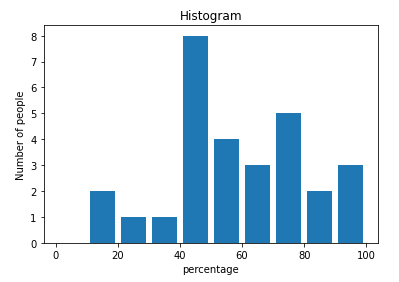
4. Histogram
The histogram and bar graph is quite similar but there is a minor difference them. A histogram is used to represent the distribution, and bar chart is used to compare the different entities. A histogram is generally used to plot the frequency of a number of values compared to a set of values ranges.
In the following example, we have taken the data of the different score percentages of the student and plot the histogram with respect to number of student. Let’s understand the following example.
Example -
from matplotlib import pyplot as plt
from matplotlib import pyplot as plt
percentage = [97,54,45,10, 20, 10, 30,97,50,71,40,49,40,74,95,80,65,82,70,65,55,70,75,60,52,44,43,42,45]
number_of_student = [0,10,20,30,40,50,60,70,80,90,100]
plt.hist(percentage, number_of_student, histtype='bar', rwidth=0.8)
plt.xlabel('percentage')
plt.ylabel('Number of people')
plt.title('Histogram')
plt.show()
Output:
Let’s understand another example.
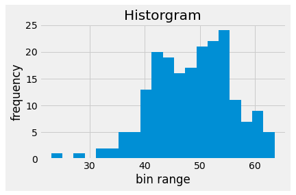
Example - 2:
from matplotlib import pyplot as plt
# Importing Numpy Library
import numpy as np
plt.style.use('fivethirtyeight')

mu = 50
sigma = 7
x = np.random.normal(mu, sigma, size=200)
fig, ax = plt.subplots()

ax.hist(x, 20)
ax.set_title('Historgram')
ax.set_xlabel('bin range')
ax.set_ylabel('frequency')

fig.tight_layout()
plt.show()
Output:
5. Scatter Plot
The scatter plot is used to compare the variable with respect to the other variables. It is defined as how one variable affected the other variable. The data is represented as a collection of points. Let’s understand the following example.
Example -
from matplotlib import pyplot as plt
from matplotlib import style
style.use('ggplot')

x = [4,8,12]
y = [19,11,7]

x2 = [7,10,12]
y2 = [8,18,24]

plt.scatter(x, y)

plt.scatter(x2, y2, color='g')

plt.title('Epic Info')
plt.ylabel('Y axis')
plt.xlabel('X axis')

plt.show()
Output:
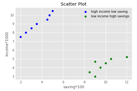
Example - 2:
import matplotlib.pyplot as plt
a = [2, 2.5, 3, 3.5, 4.5, 4.7, 5.0]
b = [7.5, 8, 8.5, 9, 9.5, 10, 10.5]

a1 = [9, 8.5, 9, 9.5, 10, 10.5, 12]
b1 = [3, 3.5, 4.7, 4, 4.5, 5, 5.2]
plt.scatter(a, b, label='high income low saving', color='b')
plt.scatter(a1, b1, label='low income high savings', color='g')
plt.xlabel('saving*100')
plt.ylabel('income*1000')
plt.title('Scatter Plot')
plt.legend()
plt.show()
Output:
In this tutorial, we have discussed all basic types of graph which used in data visualization. To learn more about graph, visit our matplotlib tutorial.