Matplotlib (Python Plotting Library)
Human minds are more adaptive for the visual representation of data rather than textual data. We can easily understand things when they are visualized. It is better to represent the data through the graph where we can analyze the data more efficiently and make the specific decision according to data analysis. Before learning the matplotlib, we need to understand data visualization and why data visualization is important.
Data Visualization

Graphics provides an excellent approach for exploring the data, which is essential for presenting results. Data visualization is a new term. It expresses the idea that involves more than just representing data in the graphical form (instead of using textual form).
This can be very helpful when discovering and getting to know a dataset and can help with classifying patterns, corrupt data, outliers, and much more. With a little domain knowledge, data visualizations can be used to express and demonstrate key relationships in plots and charts. The static does indeed focus on quantitative description and estimations of data. It provides an important set of tools for gaining a qualitative understanding.
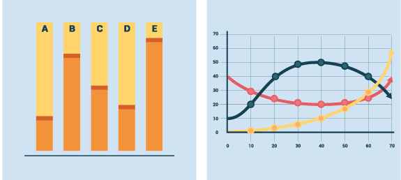
There are five key plots that are used for data visualization.

There are five phases which are essential to make the decision for the organization:
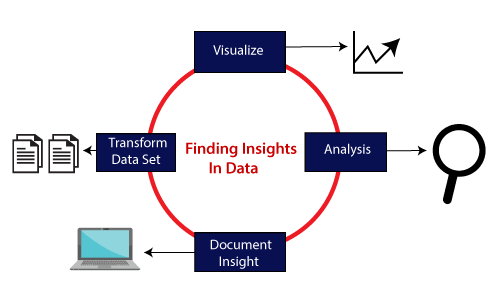
- Visualize: We analyze the raw data, which means it makes complex data more accessible, understandable, and more usable. Tabular data representation is used where the user will look up a specific measurement, while the chart of several types is used to show patterns or relationships in the data for one or more variables.
- Analysis: Data analysis is defined as cleaning, inspecting, transforming, and modeling data to derive useful information. Whenever we make a decision for the business or in daily life, is by past experience. What will happen to choose a particular decision , it is nothing but analyzing our past. That may be affected in the future, so the proper analysis is necessary for better decisions for any business or organization.
- Document Insight: Document insight is the process where the useful data or information is organized in the document in the standard format.
- Transform Data Set: Standard data is used to make the decision more effectively.
Why need data visualization?
Data visualization can perform below tasks:
- It identifies areas that need improvement and attention.
- It clarifies the factors.
- It helps to understand which product to place where.
- Predict sales volumes.
Benefit of Data Visualization
Here are some benefits of the data visualization, which helps to make an effective decision for the organizations or business:
1. Building ways of absorbing information
Data visualization allows users to receive vast amounts of information regarding operational and business conditions. It helps decision-makers to see the relationship between multi-dimensional data sets. It offers new ways to analyses data through the use of maps, fever charts, and other rich graphical representations.
Visual data discovery is more likely to find the information that the organization needs and then end up with being more productive than other competitive companies.
2. Visualize relationship and patterns in Businesses
The crucial advantage of data visualization is that it is essential to find the correlation between operating conditions and business performance in today’s highly competitive business environment.
The ability to make these types of correlations enables the executives to identify the root cause of the problem and act quickly to resolve it.
Suppose a food company is looking their monthly customer data, and the data is presented with bar charts, which shows that the company’s score has dropped by five points in the previous months in that particular region; the data suggest that there’s a problem with customer satisfaction in this area.
3. Take action on the emerging trends faster
Data visualization allows the decision-maker to grasp shifts in customer behavior and market conditions across multiple data sets more efficiently.
Having an idea about the customer’s sentiments and other data discloses an emerging opportunity for the company to act on new business opportunities ahead of their competitor.
4. Geological based Visualization
Geo-spatial visualization is occurred due to many websites providing web-services, attracting visitor’s interest. These types of websites are required to take benefit of location-specific information, which is already present in the customer details.
Matplotlib is a Python library which is defined as a multi-platform data visualization library built on Numpy array. It can be used in python scripts, shell, web application, and other graphical user interface toolkit.
The John D. Hunter originally conceived the matplotlib in 2002 . It has an active development community and is distributed under a BSD-style license . Its first version was released in 2003, and the latest version 3.1.1 is released on 1 July 2019 .
Matplotlib 2.0.x supports Python versions 2.7 to 3.6 till 23 June 2007. Python3 support started with Matplotlib 1.2. Matplotlib 1.4 is the last version that supports Python 2.6.
There are various toolkits available that are used to enhance the functionality of the matplotlib . Some of these tools are downloaded separately, others can be shifted with the matplotlib source code but have external dependencies.
- Bashmap: It is a map plotting toolkit with several map projections, coastlines, and political boundaries.
- Cartopy: It is a mapping library consisting of object-oriented map projection definitions, and arbitrary point, line, polygon, and image transformation abilities.
- Excel tools: Matplotlib provides the facility to utilities for exchanging data with Microsoft Excel.
- Mplot3d: It is used for 3D plots.
- Natgrid: It is an interface to the Natgrid library for irregular gridding of the spaced data.
Matplotlib Architecture
There are three different layers in the architecture of the matplotlib which are the following:
- Backend Layer
- Artist layer
- Scripting layer
Backend layer
The backend layer is the bottom layer of the figure, which consists of the implementation of the various functions that are necessary for plotting. There are three essential classes from the backend layer FigureCanvas (The surface on which the figure will be drawn), Renderer (The class that takes care of the drawing on the surface), and Event (It handle the mouse and keyboard events).
Artist Layer
The artist layer is the second layer in the architecture. It is responsible for the various plotting functions, like axis, which coordinates on how to use the renderer on the figure canvas.
Scripting layer
The scripting layer is the topmost layer on which most of our code will run. The methods in the scripting layer, almost automatically take care of the other layers, and all we need to care about is the current state (figure & subplot).
The General Concept of Matplotlib
A Matplotlib figure can be categorized into various parts as below:

Figure: It is a whole figure which may hold one or more axes (plots). We can think of a Figure as a canvas that holds plots.
Axes: A Figure can contain several Axes. It consists of two or three (in the case of 3D) Axis objects. Each Axes is comprised of a title, an x-label, and a y-label.
Axis: Axises are the number of line like objects and responsible for generating the graph limits.
Artist: An artist is the all which we see on the graph like Text objects, Line2D objects, and collection objects. Most Artists are tied to Axes.