It’s hard to think of a professional industry that doesn’t benefit from making data more understandable. Every STEM field benefits from understanding data—and so do fields in government, finance, marketing, history, consumer goods, service industries, education, sports, and so on.
While we’ll always wax poetically about data visualization (you’re on the Tableau website, after all) there are practical, real-life applications that are undeniable. And, since visualization is so prolific, it’s also one of the most useful professional skills to develop. The better you can convey your points visually, whether in a dashboard or a slide deck, the better you can leverage that information.
The concept of the citizen data scientist is on the rise. Skill sets are changing to accommodate a data-driven world. It is increasingly valuable for professionals to be able to use data to make decisions and use visuals to tell stories of when data informs the who, what, when, where, and how. While traditional education typically draws a distinct line between creative storytelling and technical analysis, the modern professional world also values those who can cross between the two: data visualization sits right in the middle of analysis and visual storytelling.
Examples of data visualization in action
Of course, one of the best ways to understand data visualization is to see it. What a crazy concept!
With public data visualization galleries and data everywhere online, it can be overwhelming to know where to start. We’ve collected 10 of the best examples of data visualization of all time, with examples that map historical conquests, analyze film scripts, reveal hidden causes of mortality, and more.
Tableau’s own public gallery shows off loads of visualizations made with the free Tableau Public tool, we feature some common starter business dashboards as usable templates, and Viz of the Day collects some of the best community creations. Plus, there are tons of great blogs and books about data visualization containing excellent examples, explanations, and information about best practices.
The different types of visualizations
When you think of data visualization, your first thought probably immediately goes to simple bar graphs or pie charts. While these may be an integral part of visualizing data and a common baseline for many data graphics, the right visualization must be paired with the right set of information. Simple graphs are only the tip of the iceberg. There’s a whole selection of visualization methods to present data in effective and interesting ways.
Common general types of data visualization:
- Charts
- Tables
- Graphs
- Maps
- Infographics
- Dashboards
More specific examples of methods to visualize data:
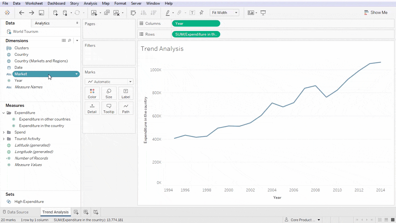
- Area Chart
- Bar Chart
- Box-and-whisker Plots
- Bubble Cloud
- Bullet Graph
- Cartogram
- Circle View
- Dot Distribution Map
- Gantt Chart
- Heat Map
- Highlight Table
- Histogram
- Matrix
- Network
- Polar Area
- Radial Tree
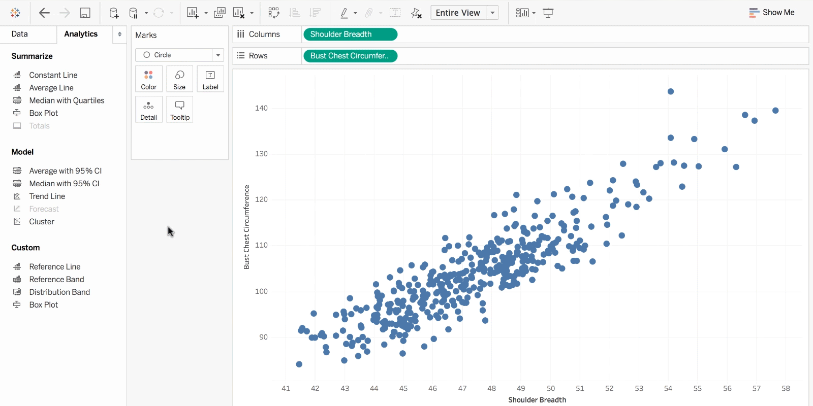
- Scatter Plot (2D or 3D)
- Streamgraph
- Text Tables
- Timeline
- Treemap
- Wedge Stack Graph
- Word Cloud
- And any mix-and-match combination in a dashboard!