A heat map can be used for comparing categories with color and size. With heat maps, you can compare two different measures together. A tree map also does the same except it is considered a very powerful visualization as it can be used for illustrating hierarchical data and part-to-whole relationships.
Both the maps help in analyzing data. While a heat map visualizes and compares different categories of data, a treemap displays a hierarchical structure of data in rectangles. Heat map visualizes measures against dimensions by depicting them in different colors. Similar to a text table with values defined in different colors.
Heatmap In Tableau
Treemap visualizes the hierarchy of data in nested rectangles. Hierarchy levels are displayed from larger rectangles to smaller ones.
Example - Below treemap shows aggregated sales totals across a range of product categories:
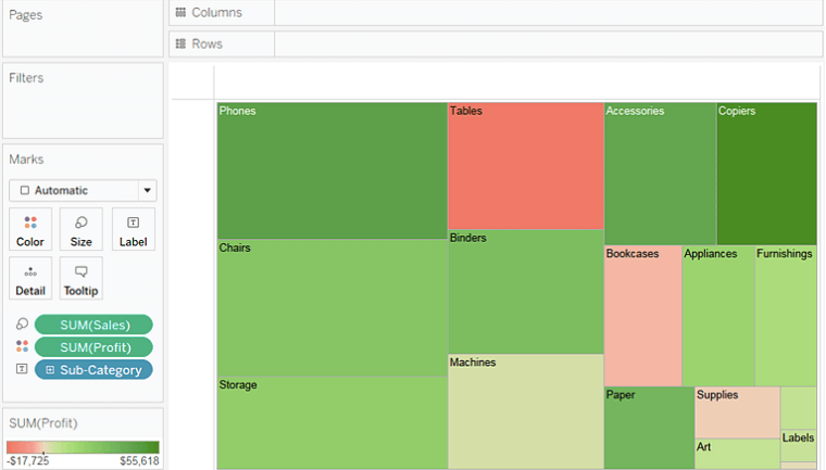
TreeMap in Tableau
Image - tableau.com
A heat map is a two-dimensional representation of information with the help of colors. Heat maps can help the user visualize simple or complex information. Treemaps are ideal for displaying large amounts of hierarchically structured (tree-structured) data.
What are heat maps?
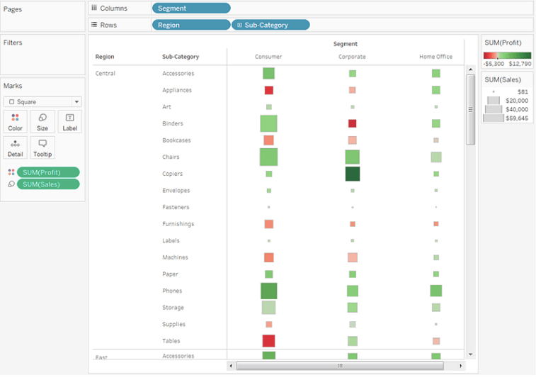
Heat map is a type of visualization tool that is very apt to compare different categories. It helps to visualize measures against dimensions with the help of colors and size to compare one or more dimensions & up to two measures. The layout is similar to a text table with variations in values encoded as colors. In heat map, you can quickly see a wide array of information.
In a heat map, one measure can be assigned to the color and another measure can be assigned to the size.
Quick Hands-On: Shows the sales and profit in all regions for different products category and sub-Category.
Analysis of visualization: The profit is represented by the color and ranges from red for loss to green for profit. The total sales are represented by the size.
Hence, it is very easy to understand the performance of different products in different regions, at one glance, just by looking at the heat map.
What are tree maps?
Tree maps are a relatively new feature in Tableau, first appearing in version 8.0. The ‘tree map’ is a chart type that displays hierarchical or part-to-whole relationships via rectangles. In case of hierarchical (tree-structured) data these rectangles are nested. The space in the view is divided into rectangles that are sized and ordered by a measure. Nested rectangles mean that hierarchy levels in the data are expressed by larger rectangles (above in the hierarchy) containing smaller ones (below in the hierarchy). The rectangles in the tree map range in size from the top left corner of the chart to the bottom right corner, with the largest rectangle positioned in the top left corner and the smallest rectangle in the bottom right corner.
In a tree map 1 or more dimensions & up to 2 measures are used to create such a map.
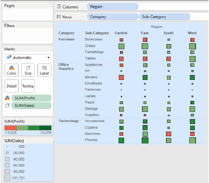
Quick Hands- On: Show the sales and profit in all regions for different products category and Sub-Category.
Analysis of the visualization: The profit (color) and sales (size) of products are given at a Category and Sub- Category level. Bigger the size of the node, greater is the sales in that state. Similarly, the greener the node, more is the profit in that state.
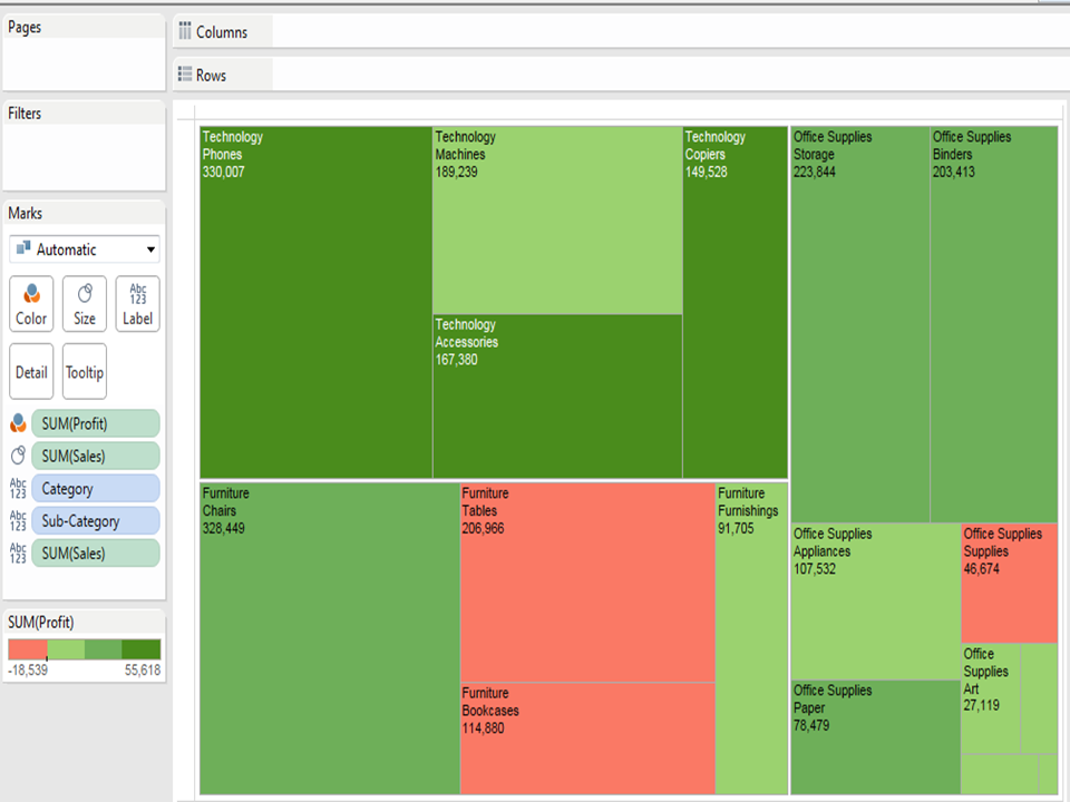
Summary: A slight disadvantage of using tree maps in Tableau is that, as the number of items increase, the amount of space allocated for each item decreases. Hence, the area available to print the labels, become small. As a result, usually, in a tree map almost all the squares or nodes will appear blank. This defect can be overcome by providing appropriate tooltips for each node. Like in heat maps, measures can be assigned to give different colors and sizes to the nodes in the tree map.