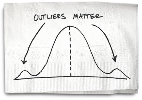
Outliers are extreme values that deviate from other observations on data , they may indicate a variability in a measurement, experimental errors or a novelty. In other words, an outlier is an observation that diverges from an overall pattern on a sample.
Most common causes of outliers on a data set:
- Data entry errors (human errors)
- Measurement errors (instrument errors)
- Experimental errors (data extraction or experiment planning/executing errors)
- Intentional (dummy outliers made to test detection methods)
- Data processing errors (data manipulation or data set unintended mutations)
- Sampling errors (extracting or mixing data from wrong or various sources)
- Natural (not an error, novelties in data)
I’ve got five methods for you to try.
Sorting Your Datasheet to Find Outliers
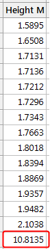
Sorting your datasheet is a simple but effective way to highlight unusual values. Simply sort your data sheet for each variable and then look for unusually high or low values.
For example, I’ve sorted the example dataset in ascending order, as shown below. The highest value is clearly different than the others. While this approach doesn’t quantify the outlier’s degree of unusualness, I like it because, at a glance, you’ll find the unusually high or low values.
Graphing Your Data to Identify Outliers
Boxplots, histograms, and scatterplots can highlight outliers.
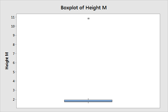
Boxplots display asterisks or other symbols on the graph to indicate explicitly when datasets contain outliers. These graphs use the interquartile method with fences to find outliers, which I explain later. The boxplot below displays our example dataset. It’s clear that the outlier is quite different than the typical data value.
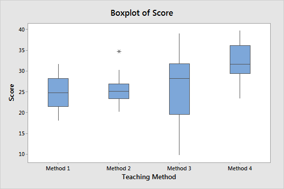
You can also use boxplots to find outliers when you have groups in your data. The boxplot below shows a different dataset that has an outlier in the Method 2 group. Click here to learn more about boxplots.
Histograms also emphasize the existence of outliers. Look for isolated bars, as shown below. Our outlier is the bar far to the right. The graph crams the legitimate data points on the far left.
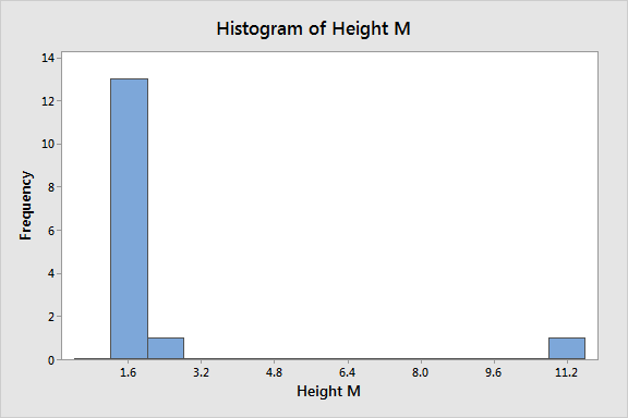
Click here to learn more about histograms.
Most of the outliers I discuss in this post are univariate outliers. We look at a data distribution for a single variable and find values that fall outside the distribution. However, you can use a scatterplot to detect outliers in a multivariate setting.
In the graph below, we’re looking at two variables, Input and Output. The scatterplot with regression line shows how most of the points follow the fitted line for the model. However, the circled point does not fit the model well.
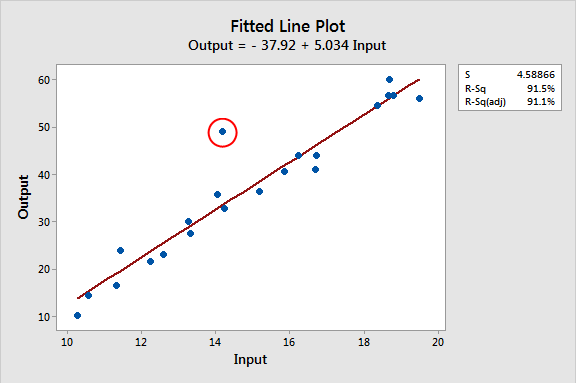
Interestingly, the Input value (~14) for this observation isn’t unusual at all because the other Input values range from 10 through 20 on the X-axis. Also, notice how the Output value (~50) is similarly within the range of values on the Y-axis (10 – 60). Neither the Input nor the Output values themselves are unusual in this dataset. Instead, it’s an outlier because it doesn’t fit the model.
This type of outlier can be a problem in regression analysis. Given the multifaceted nature of multivariate regression, there are numerous types of outliers in that realm. In my ebook about regression analysis, I detail various methods and tests for identifying outliers in a multivariate context.
For the rest of this post, we’ll focus on univariate outliers.
Using Z-scores to Detect Outliers
Z-scores can quantify the unusualness of an observation when your data follow the normal distribution. Z-scores are the number of standard deviations above and below the mean that each value falls. For example, a Z-score of 2 indicates that an observation is two standard deviations above the average while a Z-score of -2 signifies it is two standard deviations below the mean. A Z-score of zero represents a value that equals the mean.
To calculate the Z-score for an observation, take the raw measurement, subtract the mean, and divide by the standard deviation. Mathematically, the formula for that process is the following:
![]()
The further away an observation’s Z-score is from zero, the more unusual it is. A standard cut-off value for finding outliers are Z-scores of +/-3 or further from zero. The probability distribution below displays the distribution of Z-scores in a standard normal distribution. Z-scores beyond +/- 3 are so extreme you can barely see the shading under the curve.
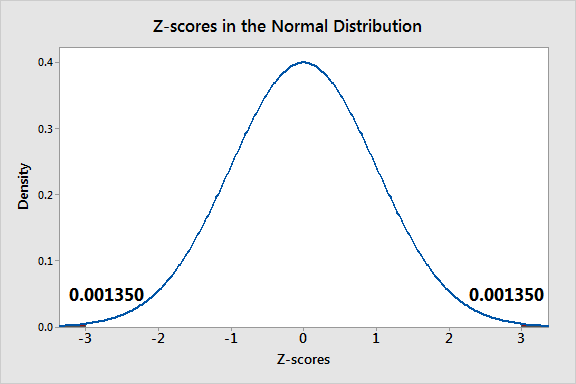
In a population that follows the normal distribution, Z-score values more extreme than +/- 3 have a probability of 0.0027 (2 * 0.00135), which is about 1 in 370 observations. However, if your data don’t follow the normal distribution, this approach might not be accurate.
Z-scores and Our Example Dataset
In our example dataset below, I display the values in the example dataset along with the Z-scores. This approach identifies the same observation as being an outlier.
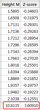
Note that Z-scores can be misleading with small datasets because the maximum Z-score is limited to ( n −1) / √ n.* Indeed, our Z-score of ~3.6 is right near the maximum value for a sample size of 15. Sample sizes of 10 or fewer observations cannot have Z-scores that exceed a cutoff value of +/-3.
Also, note that the outlier’s presence throws off the Z-scores because it inflates the mean and standard deviation as we saw earlier. Notice how all the Z-scores are negative except the outlier’s value. If we calculated Z-scores without the outlier, they’d be different! Be aware that if your dataset contains outliers, Z-values are biased such that they appear to be less extreme (i.e., closer to zero).