Gain and Lift chart are mainly concerned to check the rank ordering of the probabilities. Here are the steps to build a Lift/Gain chart:
Step 1 : Calculate probability for each observation
Step 2 : Rank these probabilities in decreasing order.
Step 3 : Build deciles with each group having almost 10% of the observations.
Step 4 : Calculate the response rate at each deciles for Good (Responders) ,Bad (Non-responders) and total.
You will get following table from which you need to plot Gain/Lift charts:

This is a very informative table. Cumulative Gain chart is the graph between Cumulative %Right and Cummulative %Population. For the case in hand here is the graph
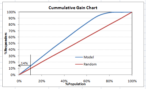
This graph tells you how well is your model segregating responders from non-responders. For example, the first decile however has 10% of the population, has 14% of responders. This means we have a 140% lift at first decile.
What is the maximum lift we could have reached in first decile? From the first table of this article, we know that the total number of responders are 3850. Also the first decile will contains 543 observations. Hence, the maximum lift at first decile could have been 543/3850 ~ 14.1%. Hence, we are quite close to perfection with this model.
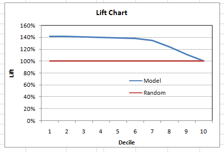
Let’s now plot the lift curve. Lift curve is the plot between total lift and %population. Note that for a random model, this always stays flat at 100%. Here is the plot for the case in hand
You can also plot decile wise lift with decile number 
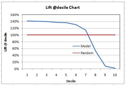
What does this graph tell you? It tells you that our model does well till the 7th decile. Post which every decile will be skewed towards non-responders. Any model with lift @ decile above 100% till minimum 3rd decile and maximum 7th decile is a good model. Else you might consider over sampling first.
Lift / Gain charts are widely used in campaign targeting problems. This tells us till which decile can we target customers for an specific campaign. Also, it tells you how much response do you expect from the new target base.