Data visualization is a way to represent data that is visually appealing and interactive. With advancements in technology, the number of business intelligence tools has increased which helps users understand data, data sets, data points, charts, graphs, and focus on its impact rather than understanding the tool itself.
Data visualization is the graphical representation of information and data. By using visual elements like charts, graphs, and maps, data visualization tools provide an accessible way to see and understand trends, outliers, and patterns in data.
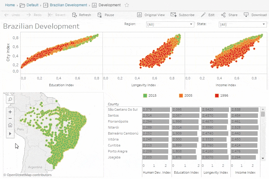
Tableau is a Data Visualisation tool that is widely used for Business Intelligence but is not limited to it. It helps create interactive graphs and charts in the form of dashboards and worksheets to gain business insights. And all of this is made possible with gestures as simple as drag and drop!
The advantages and benefits of good data visualization
Our eyes are drawn to colors and patterns. We can quickly identify red from blue, square from circle. Our culture is visual, including everything from art and advertisements to TV and movies.
Data visualization is another form of visual art that grabs our interest and keeps our eyes on the message. When we see a chart, we quickly see trends and outliers. If we can see something, we internalize it quickly. It’s storytelling with a purpose. If you’ve ever stared at a massive spreadsheet of data and couldn’t see a trend, you know how much more effective a visualization can be.