Graphs are the third part of the process of data analysis. The first part is about data extraction , the second part deals with cleaning and manipulating the data . At last, the data scientist may need to communicate his results graphically .
The job of the data scientist can be reviewed in the following picture
- The first task of a data scientist is to define a research question. This research question depends on the objectives and goals of the project.
- After that, one of the most prominent tasks is the feature engineering. The data scientist needs to collect, manipulate and clean the data
- When this step is completed, he can start to explore the dataset. Sometimes, it is necessary to refine and change the original hypothesis due to a new discovery.

- When the explanatory analysis is achieved, the data scientist has to consider the capacity of the reader to understand the underlying concepts and models .
- His results should be presented in a format that all stakeholders can understand. One of the best methods to communicate the results is through a graph .
- Graphs are an incredible tool to simplify complex analysis.
ggplot2 package
This part of the tutorial focuses on how to make graphs/charts with R.
In this tutorial, you are going to use ggplot2 package. This package is built upon the consistent underlying of the book Grammar of graphics written by Wilkinson, 2005. ggplot2 is very flexible, incorporates many themes and plot specification at a high level of abstraction. With ggplot2, you can’t plot 3-dimensional graphics and create interactive graphics.
In ggplot2, a graph is composed of the following arguments:
- data
- aesthetic mapping
- geometric object
- statistical transformations
- scales
- coordinate system
- position adjustments
- faceting
You will learn how to control those arguments in the tutorial.
The basic syntax of ggplot2 is:
ggplot(data, mapping=aes()) + geometric object arguments: data: Dataset used to plot the graph mapping: Control the x and y-axis geometric object: The type of plot you want to show. The most common object are: - Point: geom_point() - Bar: geom_bar() - Line: geom_line() - Histogram: geom_histogram()
Scatterplot
Let’s see how ggplot works with the mtcars dataset. You start by plotting a scatterplot of the mpg variable and drat variable.
Basic scatter plot
library(ggplot2) ggplot(mtcars, aes(x = drat, y = mpg)) + geom_point()
Code Explanation
- You first pass the dataset mtcars to ggplot.
- Inside the aes() argument, you add the x-axis and y-axis.
- The + sign means you want R to keep reading the code. It makes the code more readable by breaking it.
- Use geom_point() for the geometric object.
Output:

Scatter plot with groups
Sometimes, it can be interesting to distinguish the values by a group of data (i.e. factor level data).
ggplot(mtcars, aes(x = mpg, y = drat)) + geom_point(aes(color = factor(gear)))
Code Explanation
- The aes() inside the geom_point() controls the color of the group. The group should be a factor variable. Thus, you convert the variable gear in a factor.
- Altogether, you have the code aes(color = factor(gear)) that change the color of the dots.
Output:

Change axis
Rescale the data is a big part of the data scientist job. In rare occasion data comes in a nice bell shape. One solution to make your data less sensitive to outliers is to rescale them.
ggplot(mtcars, aes(x = log(mpg), y = log(drat))) + geom_point(aes(color = factor(gear)))
Code Explanation
- You transform the x and y variables in log() directly inside the aes() mapping.
Note that any other transformation can be applied such as standardization or normalization.
Output:

Scatter plot with fitted values
You can add another level of information to the graph. You can plot the fitted value of a linear regression.
my_graph <- ggplot(mtcars, aes(x = log(mpg), y = log(drat))) + geom_point(aes(color = factor(gear))) + stat_smooth(method = “lm”, col = “#C42126”, se = FALSE, size = 1) my_graph
Code Explanation
- graph: You store your graph into the variable graph. It is helpful for further use or avoid too complex line of codes
- The argument stat_smooth() controls for the smoothing method
- method = “lm”: Linear regression
- col = “#C42126”: Code for the red color of the line
- se = FALSE: Don’t display the standard error
- size = 1: the size of the line is 1
Output:

Note that other smoothing methods are available
- glm
- gam
- loess: default value
- rim
Add information to the graph
So far, we haven’t added information in the graphs. Graphs need to be informative. The reader should see the story behind the data analysis just by looking at the graph without referring additional documentation. Hence, graphs need good labels. You can add labels with labs()function.
The basic syntax for lab() is :
lab(title = “Hello Guru99”) argument: - title: Control the title. It is possible to change or add title with: - subtitle: Add subtitle below title - caption: Add caption below the graph - x: rename x-axis - y: rename y-axis Example:lab(title = “Hello Guru99”, subtitle = “My first plot”)
Add a title
One mandatory information to add is obviously a title.
my_graph + labs( title = “Plot Mile per hours and drat, in log” )
Code Explanation
-
my_graph: You use the graph you stored. It avoids rewriting all the codes each time you add new information to the graph.
-
You wrap the title inside the lab().
-
Code for the red color of the line
-
se = FALSE: Don’t display the standard error
-
size = 1: the size of the line is 1
Output:

Add a title with a dynamic name
A dynamic title is helpful to add more precise information in the title.
You can use the paste() function to print static text and dynamic text. The basic syntax of paste() is:
paste(“This is a text”, A) arguments - " ": Text inside the quotation marks are the static text - A: Display the variable stored in A - Note you can add as much static text and variable as you want. You need to separate them with a comma
Example:
A <-2010 paste(“The first year is”, A)
Output:
[1] “The first year is 2010”
B <-2018
paste (“The first year is”, A, “and the last year is”, B)
Output:
[1] “The first year is 2010 and the last year is 2018”
You can add a dynamic name to our graph, namely the average of mpg.
mean_mpg <- mean(mtcars$mpg) my_graph + labs( title = paste(“Plot Mile per hours and drat, in log. Average mpg is”, mean_mpg) )
Code Explanation
- You create the average of mpg with mean(mtcars$mpg) stored in mean_mpg variable
- You use the paste() with mean_mpg to create a dynamic title returning the mean value of mpg
Output:

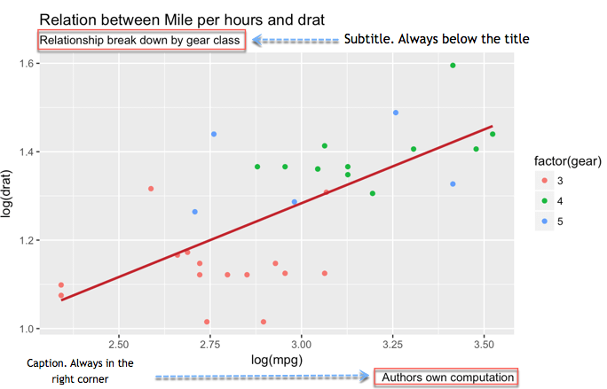
Add a subtitle
Two additional detail can make your graph more explicit. You are talking about the subtitle and the caption. The subtitle goes right below the title. The caption can inform about who did the computation and the source of the data.
my_graph + labs( title = “Relation between Mile per hours and drat”, subtitle = “Relationship break down by gear class”, caption = “Authors own computation” )
Code Explanation
- Inside the lab(), you added:
- title = “Relation between Mile per hours and drat”: Add title
- subtitle = “Relationship break down by gear class”: Add subtitle
- caption = "Authors own computation: Add caption
- You separate each new information with a comma, ,
- Note that you break the lines of code. It is not compulsory, and it only helps to read the code more easily
Output:
Rename x-axis and y-axis
Variables itself in the dataset might not always be explicit or by convention use the _ when there are multiple words (i.e. GDP_CAP). You don’t want such name appear in your graph. It is important to change the name or add more details, like the units.
my_graph + labs( x = “Drat definition”, y = “Mile per hours”, color = “Gear”, title = “Relation between Mile per hours and drat”, subtitle = “Relationship break down by gear class”, caption = “Authors own computation” )
Code Explanation
- Inside the lab(), you added:
- x = “Drat definition”: Change the name of x-axis
- y = “Mile per hours”: Change the name of y-axis
Output:

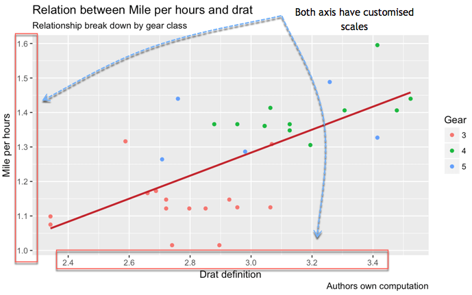
Control the scales
You can control the scale of the axis.
The function seq() is convenient when you need to create a sequence of number. The basic syntax is:
seq(begin, last, by = x) arguments: - begin: First number of the sequence - last: Last number of the sequence - by= x: The step. For instance, if x is 2, the code adds 2 to begin-1 until it reaches last
For instance, if you want to create a range from 0 to 12 with a step of 3, you will have four numbers, 0 4 8 12
seq(0, 12,4)
Output:
[1] 0 4 8 12
You can control the scale of the x-axis and y-axis as below
my_graph + scale_x_continuous(breaks = seq(1, 3.6, by = 0.2)) + scale_y_continuous(breaks = seq(1, 1.6, by = 0.1)) + labs( x = “Drat definition”, y = “Mile per hours”, color = “Gear”, title = “Relation between Mile per hours and drat”, subtitle = “Relationship break down by gear class”, caption = “Authors own computation” )
Code Explanation
- The function scale_y_continuous() controls the y-axis
- The function scale_x_continuous() controls the x-axis .
- The parameter breaks controls the split of the axis. You can manually add the sequence of number or use the seq()function:
- seq(1, 3.6, by = 0.2): Create six numbers from 2.4 to 3.4 with a step of 3
- seq(1, 1.6, by = 0.1): Create seven numbers from 1 to 1.6 with a step of 1
Output:
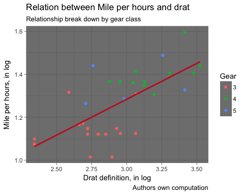
Theme
Finally, R allows us to customize out plot with different themes. The library ggplot2 includes eights themes:
- theme_bw()
- theme_light()
- theme_classis()
- theme_linedraw()
- theme_dark()
- theme_minimal()
- theme_gray()
- theme_void()
my_graph + theme_dark() + labs( x = “Drat definition, in log”, y = “Mile per hours, in log”, color = “Gear”, title = “Relation between Mile per hours and drat”, subtitle = “Relationship break down by gear class”, caption = “Authors own computation” )
Output:

Save Plots
After all these steps, it is time to save and share your graph. You add ggsave('NAME OF THE FILE) right after you plot the graph and it will be stored on the hard drive.
The graph is saved in the working directory. To check the working directory, you can run this code:
directory <-getwd() directory
Let’s plot your fantastic graph, saves it and check the location
my_graph + theme_dark() + labs( x = “Drat definition, in log”, y = “Mile per hours, in log”, color = “Gear”, title = “Relation between Mile per hours and drat”, subtitle = “Relationship break down by gear class”, caption = “Authors own computation” )
Output:
ggsave(“my_fantastic_plot.png”)
Output:
Saving 5 x 4 in image
Note : For pedagogical purpose only, we created a function called open_folder() to open the directory folder for you. You just need to run the code below and see where the picture is stored. You should see a file names my_fantastic_plot.png.
Run this code to create the function open_folder <- function(dir) { if (.Platform[‘OS.type’] == “windows”) { shell.exec(dir) } else { system(paste(Sys.getenv(“R_BROWSER”), dir)) } } # Call the function to open the folder open_folder(directory)
Summary
You can summarize the arguments to create a scatter plot in the table below:
| Objective | Code |
|---|---|
| Basic scatter plot | ggplot(df, aes(x = x1, y = y)) + geom_point() |
| Scatter plot with color group | ggplot(df, aes(x = x1, y = y)) + geom_point(aes(color = factor(x1)) + stat_smooth(method = “lm”) |
| Add fitted values | ggplot(df, aes(x = x1, y = y)) + geom_point(aes(color = factor(x1)) |
| Add title | ggplot(df, aes(x = x1, y = y)) + geom_point() + labs(title = paste(“Hello Guru99”)) |
| Add subtitle | ggplot(df, aes(x = x1, y = y)) + geom_point() + labs(subtitle = paste(“Hello Guru99”)) |
| Rename x | ggplot(df, aes(x = x1, y = y)) + geom_point() + labs(x = “X1”) |
| Rename y | ggplot(df, aes(x = x1, y = y)) + geom_point() + labs(y = “y1”) |
| Control the scale | ggplot(df, aes(x = x1, y = y)) + geom_point() + scale_y_continuous(breaks = seq(10, 35, by = 10)) + scale_x_continuous(breaks = seq(2, 5, by = 1) |
| Create logs | ggplot(df, aes(x =log(x1), y = log(y))) + geom_point() |
| Theme | ggplot(df, aes(x = x1, y = y)) + geom_point() + theme_classic() |
| Save | ggsave(“my_fantastic_plot.png”) |