SQL
SQL
 HTML/CSS/JS
 Coding


 Settings
 Logout
Histogram
A histogram chart is a chart that displays the shape of the distribution.
A histogram looks like a bar chart but group values for a continuous measure into range. In the histogram, each bar represents the height of the number of values present in that range.
To create a histogram, we need only one measure. It creates the additional bin field for the measure.
For example , consider the data source such as Sample-Superstore , and if you to find the Quantities of sales for different Segment . For this, follow the below procedure step by step, such as:
Step 1: Go to the worksheet.
Step 2: Drag the measure Quantity into the columns shelf.
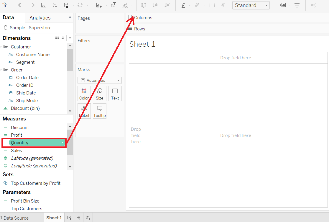
Step 3: Click on the " show me " toolbar and select the histogram chart icon, shown in the below screenshot.

NOTE: The histogram chart is available in “show me” when the view contains only one measure and no dimensions.
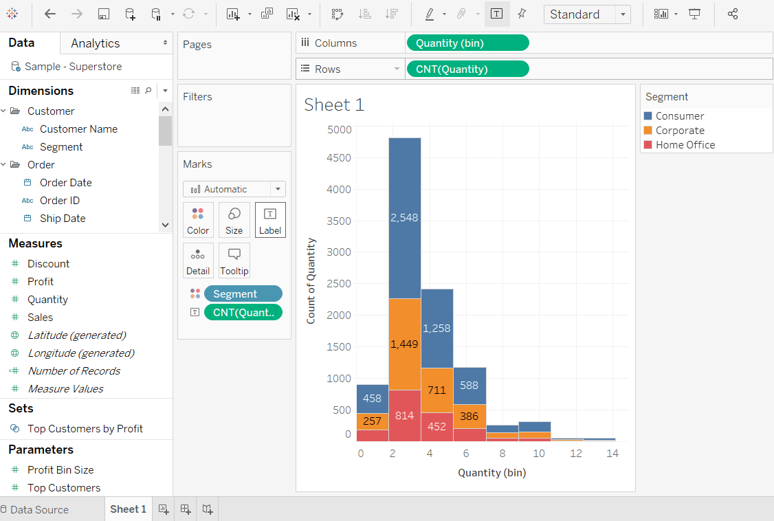
Step 4: After selecting the histogram chart as the chart type. Then,
- The view changes and shows vertical bars, with a continuous X-axis and Y-axis.
- The measure Quantity with SUM aggregate in columns shelf is replaced by continuous Quantity(bin) dimension.
- The Quantity field moves to the rows shelf and aggregation changes from SUM to CNT or (Count).

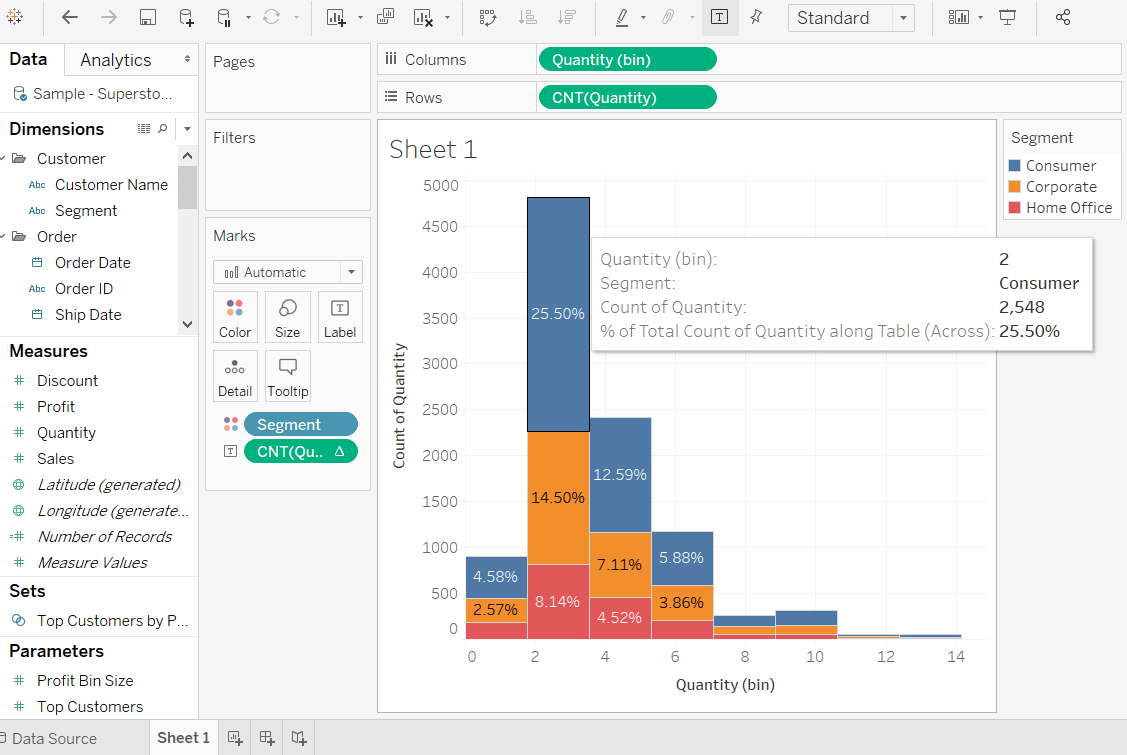
Step 5: Drag the dimension Segment and drop into the Color shelf under the Marks pane.

After adding the Segment field to Color shelf, you can see a relationship between the Segment field and the Quantity of item as per order is shown in the below screenshot.

Step 6: Hold the Ctrl key in the keyboard and drag CNT(Quantity) field from the rows shelf Label shelf under the Marks pane.
Step 7: Right-click on the CNT(Quantity) field in Marks pane. And
- Click on the Quick Table Calculation option from the list.
- Select the Percent of Total option.

Now each colored section of each bar shows its percentage of total quantity shown in the following screenshot.