R Histogram
A histogram is a type of bar chart which shows the frequency of the number of values which are compared with a set of values ranges. The histogram is used for the distribution, whereas a bar chart is used for comparing different entities. In the histogram, each bar represents the height of the number of values present in the given range.
For creating a histogram, R provides hist() function, which takes a vector as an input and uses more parameters to add more functionality. There is the following syntax of hist() function:
hist(v,main,xlab,ylab,xlim,ylim,breaks,col,border)
Here,
| S.No | Parameter | Description |
|---|---|---|
| 1. | v | It is a vector that contains numeric values. |
| 2. | main | It indicates the title of the chart. |
| 3. | col | It is used to set the color of the bars. |
| 4. | border | It is used to set the border color of each bar. |
| 5. | xlab | It is used to describe the x-axis. |
| 6. | ylab | It is used to describe the y-axis. |
| 7. | xlim | It is used to specify the range of values on the x-axis. |
| 8. | ylim | It is used to specify the range of values on the y-axis. |
| 9. | breaks | It is used to mention the width of each bar. |
Let?s see an example in which we create a simple histogram with the help of required parameters like v, main, col, etc.
Example
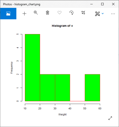
# Creating data for the graph.
v <-  c(12,24,16,38,21,13,55,17,39,10,60)

# Giving a name to the chart file.
png(file = "histogram_chart.png")

# Creating the histogram.
hist(v,xlab = "Weight",ylab="Frequency",col = "green",border = "red")

# Saving the file.
dev.off()
Output:
Let?s see some more examples in which we have used different parameters of hist() function to add more functionality or to create a more attractive chart.
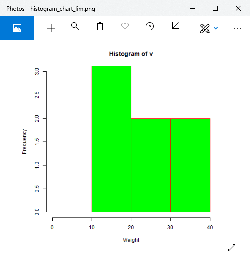
Example: Use of xlim & ylim parameter
# Creating data for the graph.
v <-  c(12,24,16,38,21,13,55,17,39,10,60)

# Giving a name to the chart file.
png(file = "histogram_chart_lim.png")

# Creating the histogram.
hist(v,xlab = "Weight",ylab="Frequency",col = "green",border = "red",xlim = c(0,40), ylim = c(0,3), breaks = 5)

# Saving the file.
dev.off()
Output:
Example: Finding return value of hist()
# Creating data for the graph.
v <-  c(12,24,16,38,21,13,55,17,39,10,60)

# Giving a name to the chart file.
png(file = "histogram_chart_lim.png")
# Creating the histogram.
m<-hist(v)
m
Output:

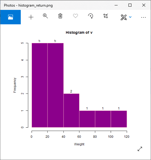
Example: Using histogram return values for labels using text()
# Creating data for the graph.
v <-  c(12,24,16,38,21,13,55,17,39,10,60,120,40,70,90)
# Giving a name to the chart file.
png(file = "histogram_return.png")

# Creating the histogram.
m<-hist(v,xlab = "Weight",ylab="Frequency",col = "darkmagenta",border = "pink", breaks = 5)
#Setting labels
text(m$mids,m$counts,labels=m$counts, adj=c(0.5, -0.5))
# Saving the file.
dev.off()
Output:
Example: Histogram using non-uniform width
    # Creating data for the graph.
    v <-  c(12,24,16,38,21,13,55,17,39,10,60,120,40,70,90)
    # Giving a name to the chart file.
    png(file = "histogram_non_uniform.png")
    # Creating the histogram.
    hist(v,xlab = "Weight",ylab="Frequency",xlim=c(50,100),col = "darkmagenta",border = "pink", breaks=c(10,55,60,70,75,80,100,120))
    # Saving the file.
    dev.off()
Output:
