Tableau Bump Chart
The bump chart is used to compare two dimensions using one of the measure value. It explores the changes in Rank of value over a time dimension or place dimension or any other relevant dimension.
The bump chart can take two dimensions with zero or more measures.
For example , consider a data source such as sample-superstore , if you want to find variations between the Ship Mode of the product and the Sub-Category .
Step1: Drag the dimension Sub-Category to the column shelf.
Step2: Drag the dimension Ship Mode to the color shelf.
By default, it creates the following view of the chart.

Step3: Create the calculated field.
-
Go to the Analysis and create a calculated field.
-
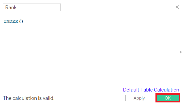
Give a field name to the calculated field such as Rank .
-
Write the expression “Index ()” in the calculated field calculation area. It creates an index for the current row in the partition.
-
Click on the OK button.
-
The new calculated field Rank will be visible in the Measure section.
-
Drag the Rank field to the row shelf.
-
Right-click on the Rank field and convert into “Discrete” .
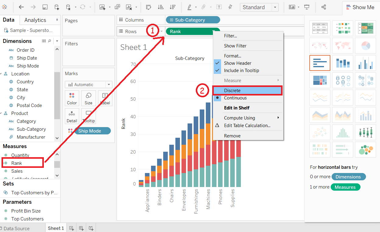
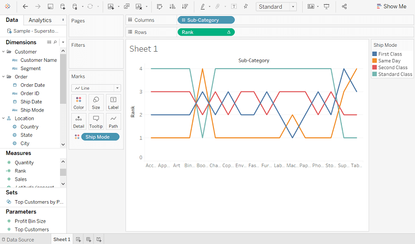
After that, the following view appears that shows the dimension Sub-Category with each Ship Mode .

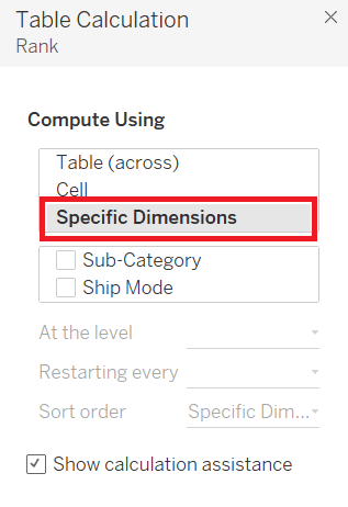
Step5: Apply some more calculations to the calculated field Rank using the measure Profit .
-
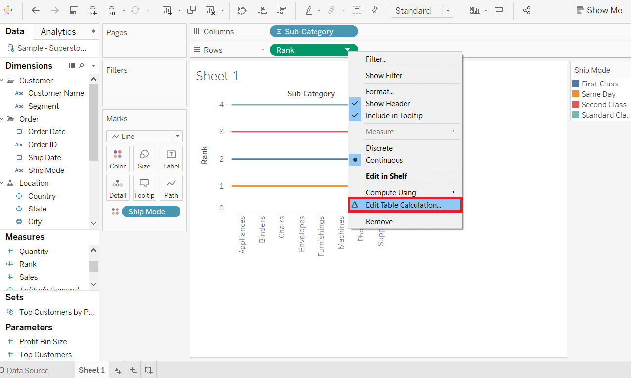
Right-click on the Measure Rank . And
-
Choose " Edit Table Calculation " option.
-
It opens the Table Calculation window.
-
Then, choose the " Specific Dimensions " option.
-
Select the Sub-Category field and Ship Mode field.
-
And, choose the sorting by the Profit field using partition by Sub-Category and addressed by Ship Mode .
The following view will appear shown in the below screenshot.

After completion of the all above steps, you will get the bump chart as shown in the below screenshot. It shows the variation of the Profit for each Ship Mode across different subcategories.