SQL
SQL
 HTML/CSS/JS
 Coding


 Settings
 Logout
Tableau Line Chart
A line Chart can compare the data over different periods. A series of dots create a line chart. These dots represent the measured values in each period.
measure and a dimension are taken two axes of the chart area in the line chart. The pair of values for each observation becomes a point. After joining all these points would become a line that shows the variation between the dimensions and measures.
The procedure to create a line graph is shown step by step below.
For example , consider a data source such as Sample-Superstore and its dimensions and measures.
Step1: Select one dimension and one measure to create a simple line chart.
-
Drag the dimension Order Date into Columns Shelf.
-
And Sales into the Rows shelf.
-
It creates the line chart by default or Chooses the Line chart from the " Show Me " button.
You will view the following line chart that shows the variation of Sales for different Order Date showing in the below screenshot.

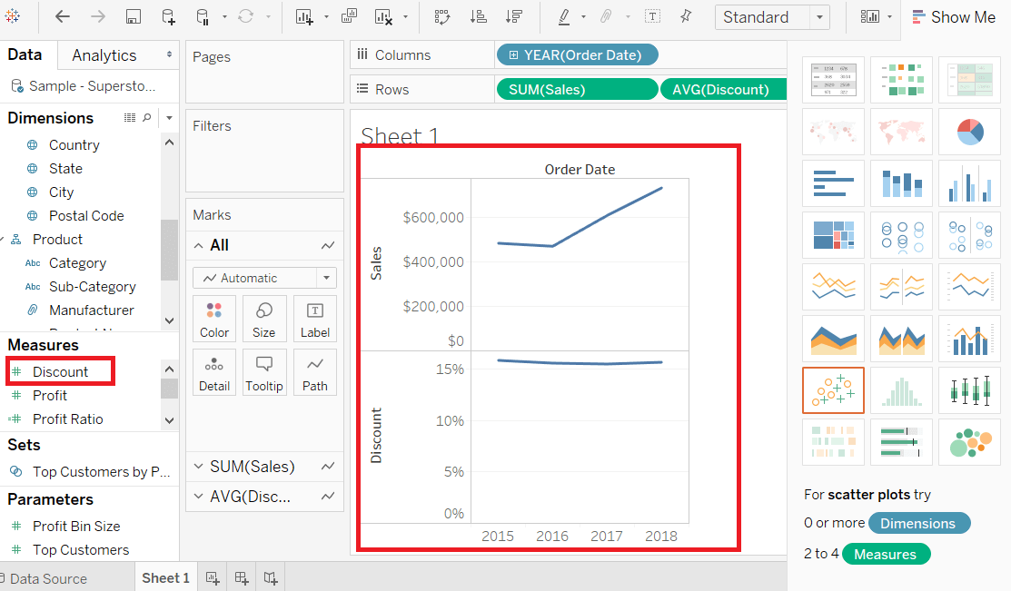
Multiple Measure Line Chart
You can use one dimension with two or more measures in a single line chart. It produces various line charts in one pane. Each pane represents the variation between a dimension and the measures.
Step1: Drag the dimension Order Date into Columns Shelf.
Step2: Drag measures Sales and Discount into the Rows shelf.
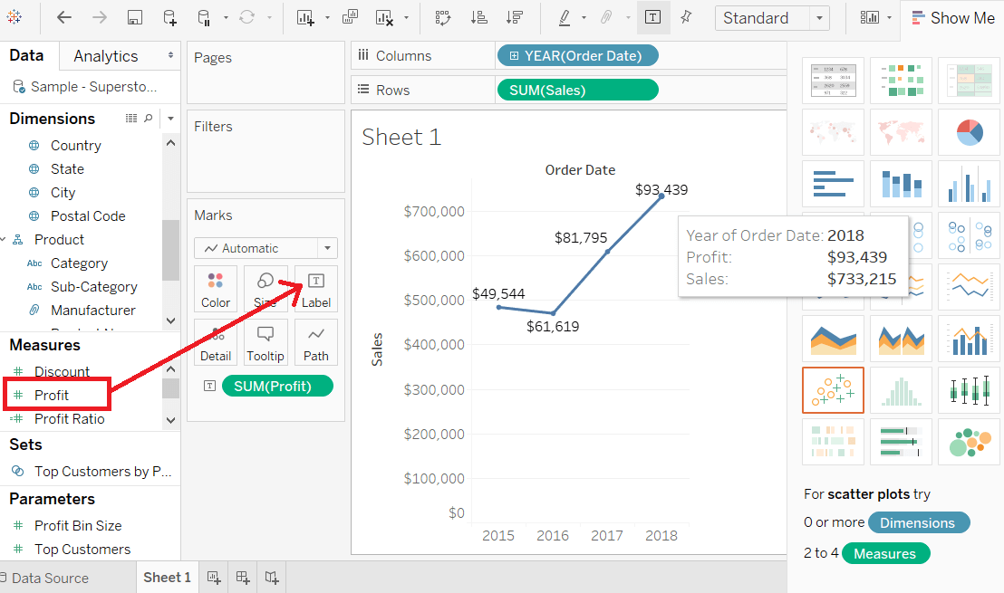
Line Chart with Label
Each of the points that creates the line chart are labeled to make the values of the measure visible.
Step1: Drop another measure Profit ratio into the " Labels " pane in the " Marks " card.
Step2: Choose average as the aggregation, and you will view the below chart showing the labels.